
UberEvent
A Seamless Ride to Your Next Event
Role - UX&UI Designer
Case study
Mobile App
A. Introduction
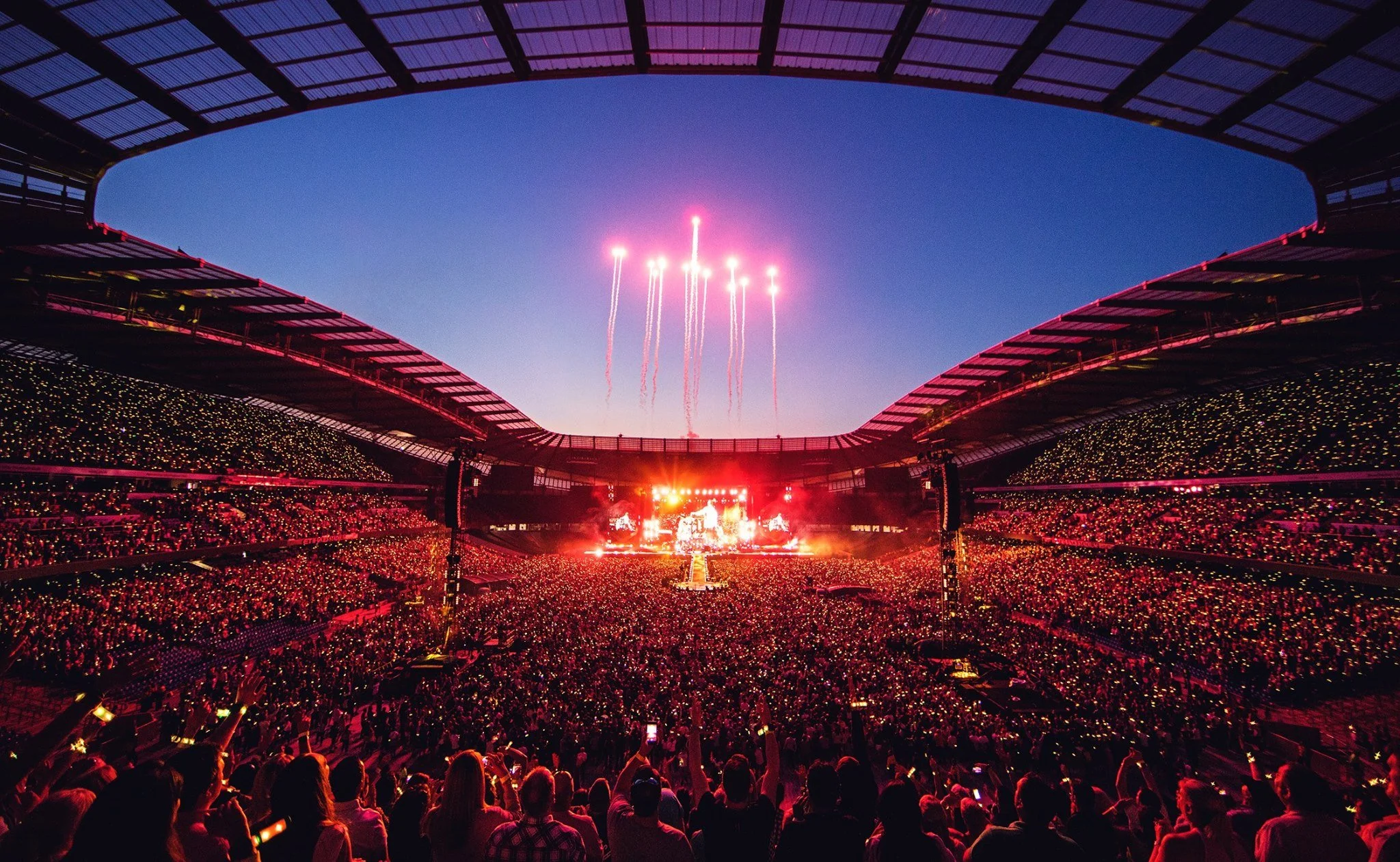
As part of a UX/UI project, we identified a current challenge in the transportation world: high taxi costs for large events created a poor user experience.
The goal of the project was to offer an innovative solution that would help users reach events more conveniently, efficiently, and affordably.
B. The Problem
Users experience real difficulties when trying to order taxis for large events, mainly due to:
These key problems create frustration and negatively impact the overall user experience, leading users to seek alternative transportation options.
These challenges presented an opportunity:
Instead of users giving up on taxi services during major events, we saw a chance to create a smarter, more affordable, and community-driven ride-sharing solution — improving accessibility and user experience at the moments it matters most.
Expensive Rides

Taxi rides through the apps are considered very expensive, which causes users to avoid using them frequently.
No Price Estimate

No Ride Cost Prediction, users struggle to predict the cost of the ride before booking, which creates discomfort and a lack of confidence in the service.
Service Overload at Events

During peak times, especially before and during major events, the services become overcrowded, requiring long wait times, leading to an unpleasant user experience.
C. Research
To deeply understand user needs and pain points, we conducted:
1.
User Research
We interviewed five participants to understand their experience with taxi apps, focusing on habits, preferences, and pain points. We also conducted observational studies and reviewed online data and industry reports.
2.
Key Findings
One of the main insights was that using taxis through the app—and likely taxis in general—is perceived as very expensive. As a result, users tend to use the service rarely, considering it a costly and non-essential expense
3.
Target Audience & Competitors
Our research focused on a broad audience of taxi app users, ranging from ages 18 to 66. To gain a deeper understanding, we also interviewed users of competing apps such as Gett and Yango, comparing their experiences and challenges across different platforms.
Translating Insights into Product Solutions
Objectives

Reduce ride costs for major events
Key Features
Shared Rides to Reduce Costs - Offering shared rides for users attending major events.

Improve user experience with taxi apps for event-goers
Known Ride Cost in Advance - Displaying the ride cost upfront, so users know exactly what they will pay.

Ensure a ride on busy event days
Guaranteed Ride on Busy Days - Offering the option to pre-book a ride for major events to avoid delays or unavailability.
D. The Goals
Based on user research and key insights, we defined three main goals to guide the solution design.
These goals focused on improving affordability, enhancing service availability, and building user trust during high-demand events.
1. Reduce Ride Costs for Major Events
Help users afford transportation by offering lower-cost shared ride options, making it easier and more accessible to attend events.
2. Improve Price Transparency
Provide users with upfront fare estimates to minimize uncertainty, build trust, and enhance confidence in choosing shared rides.
3. Enhance Service Availability During Peak Times
Ensure that users can easily find available rides during busy event times by offering pre-booking options and dynamic ride matching.
E. Ideation – Team Brainstorming
After identifying key pain points through research, our team conducted a collaborative ideation session.
We explored different ways to improve affordability, ride coordination, and event transportation experiences.
Here’s a snapshot of the ideas that emerged during our brainstorming.


We translated our solution ideas into early wireframes to define the structure, flow, and user interactions.
These later evolved into the final UI, with a focus on clarity, price transparency, and ride coordination for events.
G. Wireframes & Final UI
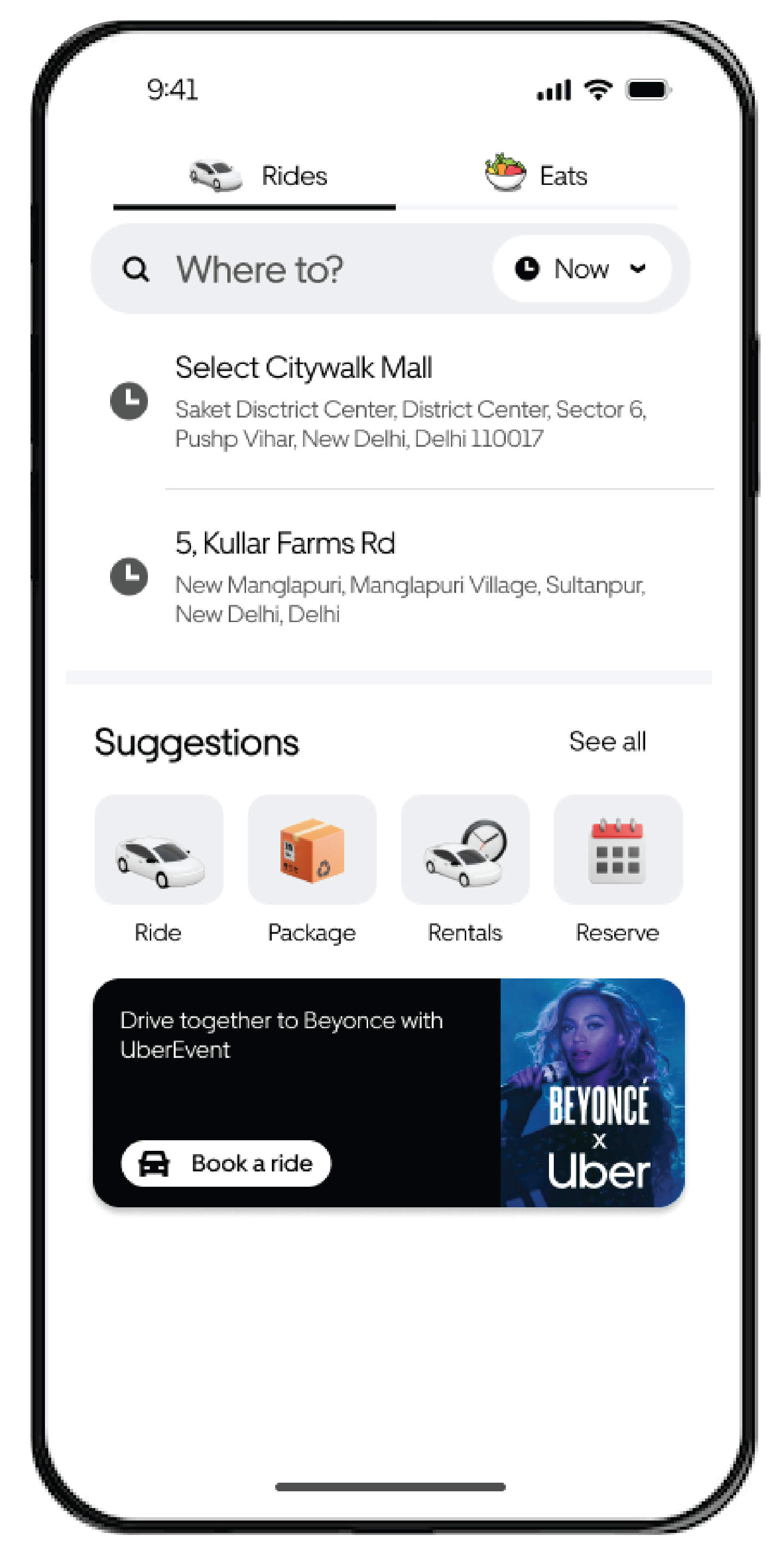
Entry Point Placement - We tested different ways to introduce the feature — icon, banner, color, and position — to find the most effective entry point.
1.

📌 Test One – Access via Icon (Noticed by Few)
We started by adding the feature as a small icon with a “New” tag, based on Uber’s design system. But during testing, most users either missed it completely or didn’t know what it was for. Not ideal.


📌 Test Two – Banner Integration (Still Low Visibility)
So we tried a banner instead — something more visual, still within the design system.
It definitely got a bit more attention than the icon, but the white color just didn’t stand out enough. Still not working.


📌 Test Three – Final Banner Design (Effective)
We kept the banner but changed its color to black and moved it to the bottom of the Suggestions section.
That did the trick. Users noticed it instantly, and it finally felt like it belonged there.
It’s a simple tweak, but there’ a big difference.
Refining the Pickup Flow - We tested different ways for users to select a pickup point near event venues.
Each version helped us learn and improve, so instead of graying out early options, we kept all screens in color to reflect their role in the process.
2.


Step One – Flyer-Based Selection (Visually Clear, Functionally Weak)
A simple flyer layout with a drop-down felt clean, but many users didn’t notice the drop-down or understand they could change the location. It lacked clarity.

Step Two – Map with Inline Search (Familiar, But Overwhelming)
Switching to a map made the flow feel more familiar, like other ride apps.
But it ended up being too busy — especially in time-sensitive moments like event nights.


We split the process into two calm, focused steps: first, choose your destination, then pick a nearby spot. This version felt the most intuitive and reduced user stress, so we moved forward with it.
Final Design Step Three - Split Layout
H. Outcomes & Insights
Through small but smart changes, we made the user experience smoother, clearer, and more user-friendly.
Improved Entry Point Visibility
Switched to a black banner — users noticed it faster and entered the flow more smoothly.
Reduced Decision Friction
Split booking into 2 steps — made it easier to choose and reduced overwhelm.
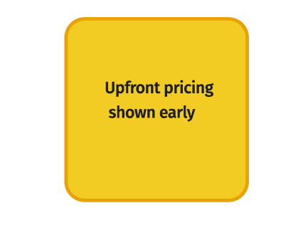
Increased Trust Through Upfront Pricing
Showing prices early boosted confidence and reduced hesitation.
I learned that thoughtful UX tweaks—even minor ones—can make experiences clearer, easier, and more trustworthy.
I. Final Reflection
Home Screen with Banner – The main screen shows the banner that directs to the feature.

Enter the Convenient Pickup Address – The screen where the user enters their preferred pickup area or address.

Choosing Suggested Pickup Point – Displaying the suggested pickup point the app offers.

Push Notification Reminder 30 Minutes Before Pickup – The app sends a push notification reminder 30 minutes before the pickup time.

Code Provided to the Driver – The code shown to the user for driver identification and ride confirmation.
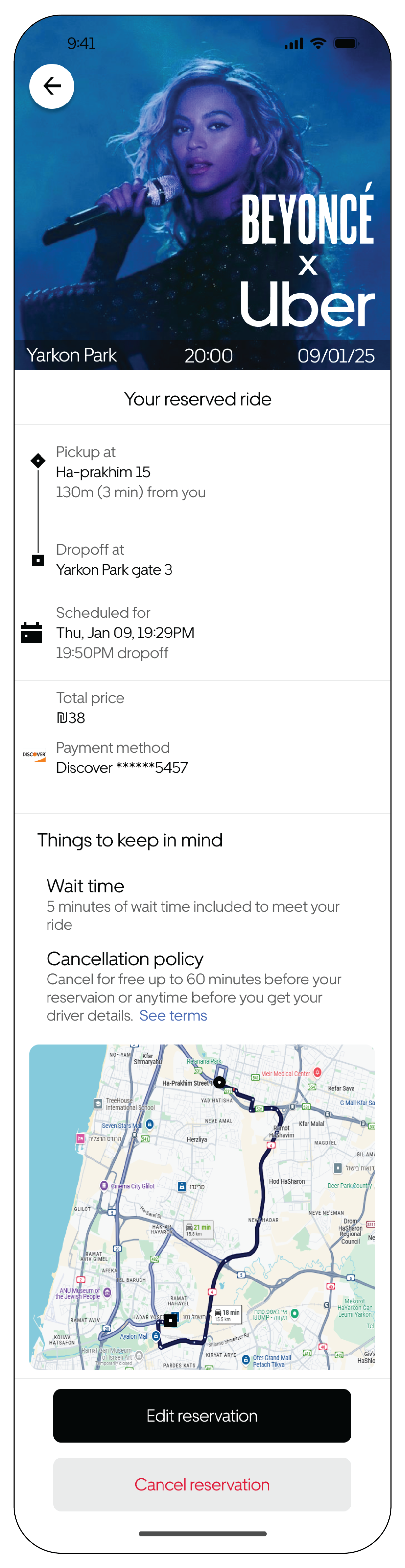

Map Display and Edit Option – The screen shows the map with the option to edit if needed.